The Weight of the Line
I was halfway through a sleeve last week when the client, a quiet guy who'd been staring at the wall for two hours, suddenly asked, "Do you ever get tired of making things pretty?" He wasn't being rude. He was just tired. Tired of the pressure to make everything in his life, including the art on his body, fit some external idea of beauty. I knew exactly what he meant. Sometimes, you don't want pretty. You want true. You want something that feels like it grew there, not like it was placed.
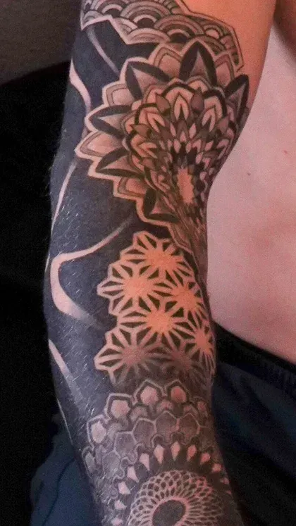
The Weight of the Line
This piece is a blackwork sleeve. That term gets thrown around a lot, but here, it means something specific. It's not just an absence of color. It's the presence of weight, of history, of a decision made in permanent ink. The style is traditional, but not in the flash-on-the-wall sense. It's traditional in its commitment to the fundamentals: bold lines that will hold, solid black that will last, and a composition that respects the body it lives on. This isn't a sketch transferred to skin. It's architecture. Every line is a load-bearing wall. The negative space isn't empty; it's structural, carved out by the dense patterns around it. When you work in pure black and gray, there's nowhere to hide. A wobbly line, a patchy fill, a poorly planned shape—it all shows. The medium is brutally honest.
Building a World from Nothing
The technical challenge here is one of contrast and commitment. You start with a blank arm, a needle, and a bottle of black ink. Your entire world is built from those two things. The depth doesn't come from a palette of grays; it comes from the density of the linework, the strategic use of solid black fills, and the careful preservation of skin tone to act as your highlight. You're essentially drawing with light and shadow, but your only tool for creating light is to *not* put ink somewhere. It's a subtractive process. You lay down a field of black, and then you carve the light back out of it with more needles, more passes, more patience. The flow had to wrap the shoulder and bicep perfectly, turning the corner without breaking the pattern's rhythm. It's easy to make a flat design look good on paper. Making it look like it was always meant to exist on this particular, moving, three-dimensional form is the whole game.
A Collaboration in Silence
The client came in with a folder of old nautical charts, illustrations of ironwork from industrial catalogs, and photos of weathered stone carvings. He didn't want a ship or an anchor. He wanted the *feel* of those things. The reliability of a chart, the strength of forged iron, the permanence of stone. We talked about it for maybe ten minutes. Then the real collaboration began: the quiet one. He sat, I drew directly on his skin with a marker, building the patterns around his musculature. He'd glance in the mirror, nod, and we'd continue. The meaning wasn't in a specific symbol. It was in the aggregate. It was in the weight of it. By the final session, he looked at the completed sleeve, flexed his arm, and just said, "Yeah." That was the entire review. It was the best one I've ever gotten.
I have really been enjoying these deep dives into the mythological and surreal worlds. After years of focusing heavily on realism and reference based work, shifting into storytelling and symbolic imagery feels like a creative rebirth. Thank you for being part of the journey. If you are interested in collaborating on a project, you can explore my work and reach out through UnorthodoxTattoo.com or visit my personal site at MickeySchlick.com or visit the shop at MontanaTattooCompany.com. For more insight into mythology inspired surrealism, visit the Neo Japanese Surrealism page at this link. Book a consultation, explore portfolios, and bring your idea to life. The studio is fully automated with aftercare, directions, booking options, and consistent customer service available 24 hours a day at 406-215-4321. If you would like to talk with me directly, just ask and I will connect with you as soon as possible.
